
How to Analyze Facebook Ads: Treat Your Data Like a Smorgasbord
Want to learn how to analyze your Facebook ads without feeling overwhelmed with what’s on your plate? Just think like a Scandinavian at mealtime: Attend to the little details. Be selective. Keep things separated. Digest. Then get moving. In this blog post, I’ll walk you through 5 helpful tips to analyze and improve your Facebook ad results and make your ad campaigns as successful as possible.
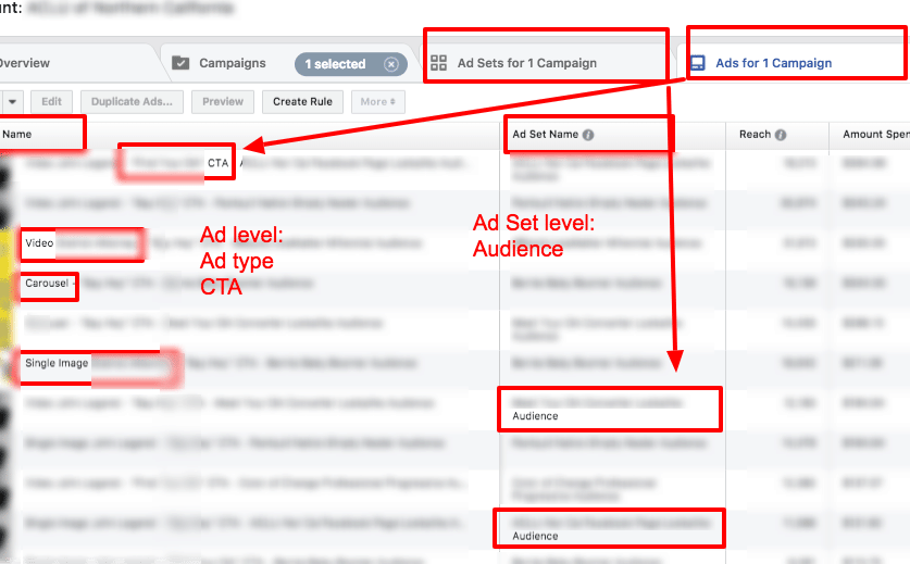
In this example campaign, we created multiple ad sets based on target audiences and tested multiple ad variations based on ad format, creative, and call-to-action.
Step #1 – Attend to the Little Details: When naming your ads, include every detail separated by delimiters
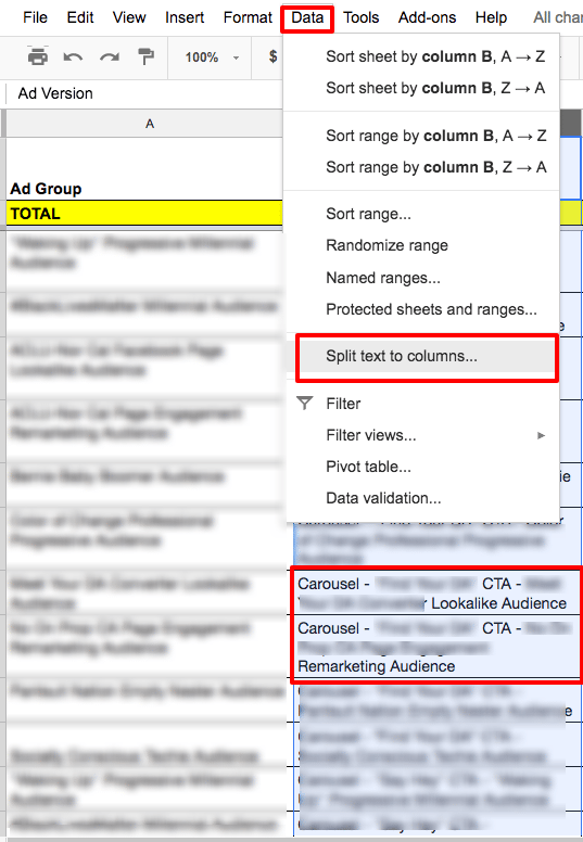
Sometimes it’s the little things that make the biggest difference. Including all the relevant data in your individual ad names will help you segment and analyze your results to see trends across different variables. When naming your ads, I recommend including the name of each individual variation you’re using (ex. Audience, gender, device, ad type, etc.) separated by dashes (“-”). The advantage of including all details is that once you export and begin to analyze your data, you’ll be able to split the ad name into individual columns (using “Data” > “Split Text the Columns” in Google Sheets), which will allow you to sort your data by segment as well as create pivot tables for each individual segment (see step #3).
For this campaign, I tested different audiences on the ad set level and different ad types (ex. Carousel, single image, video) and calls-to-action (CTAs) on the ad level. So an individual ad name would look something like this:
Carousel – “[Your CTA]” CTA – [Audience Name] Audience
In this case, “Carousel” refers to one ad type being tested. “[Your CTA]” CTA refers to a copy variation in the ad call-to-action. “[Audience Name] Audience” is the audience being targeted on the ad set level.
Step #2 – Be Selective: Customize and Save Your Ad Reports
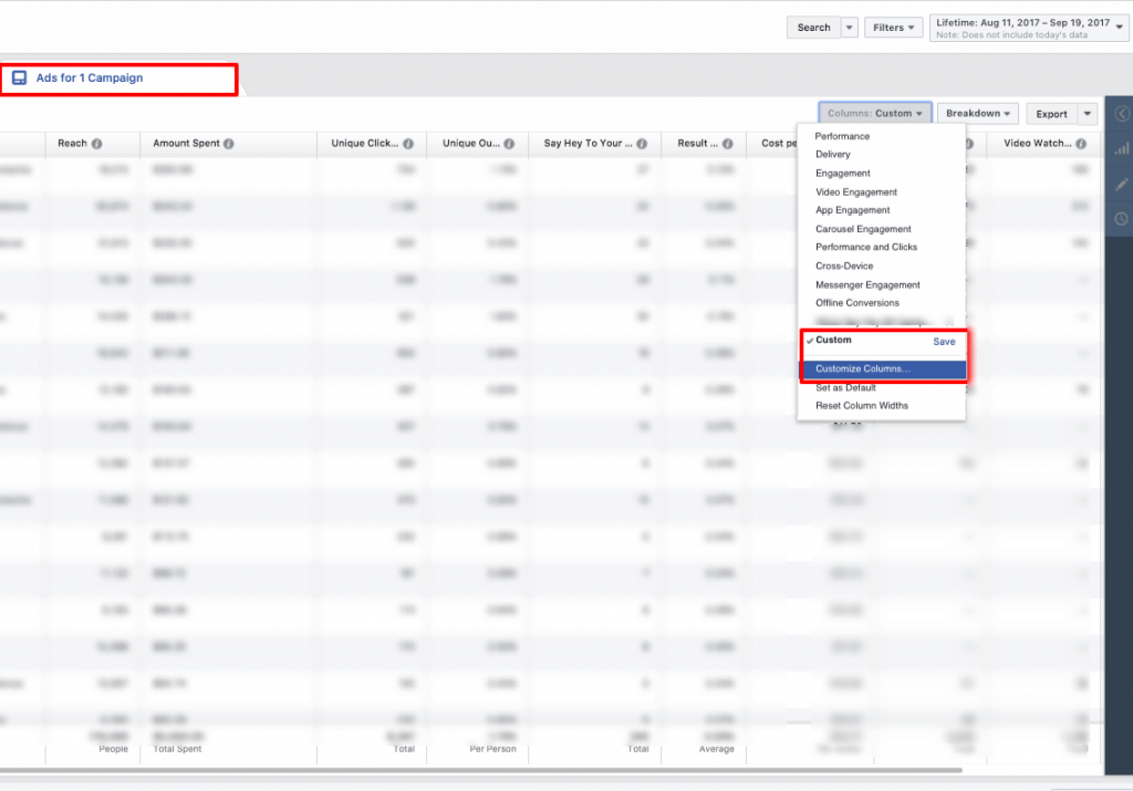
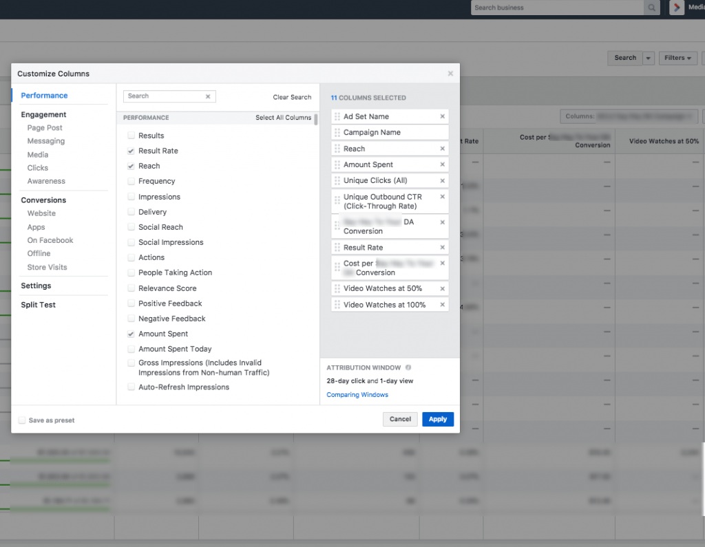
Not all data is worth consuming. You’re allowed to be picky. I recommend customizing your Facebook Ads Manager columns to include the most important metrics for your campaign and arrange them in the order that makes sense for you. You can set custom columns on the ad set and ad level (and the campaign level, if you’re running multiple campaigns). Which columns you choose will depend on the goals and the most important metrics of your campaign.
- For example, the goal of these ads were to encourage people to take an action on the website, so the most important metrics are website conversions and cost-per-acquisition.
- We also looked at video views (50%, 100%) for our video ads, to see how many people watched half or all of the video.
- And metrics like click-through-rate and completion rate are helpful performance indicators for your ads (and landing page).
Save and name this custom column preset in order to access it in the future. Next, download your results from Facebook.
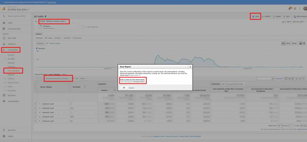
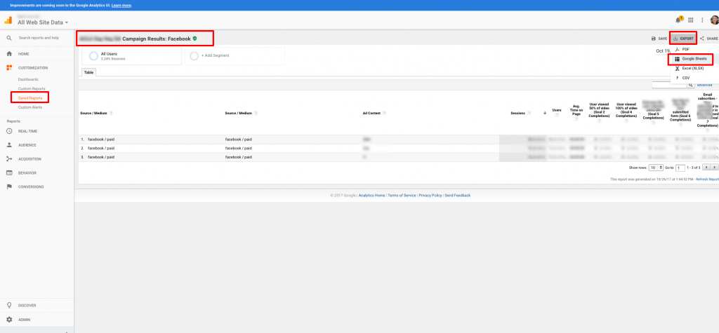
In Google Analytics, I recommend downloading a report containing conversion data. Filter your report by source / medium (Facebook / Paid) and campaign (i.e. the name of your campaign, used in your UTM) and use “ad content” as the secondary dimension. You can create and save a custom report to make future exports easy. For how to set up these reports, check out my blog post How to Track Conversions in Google Analytics.
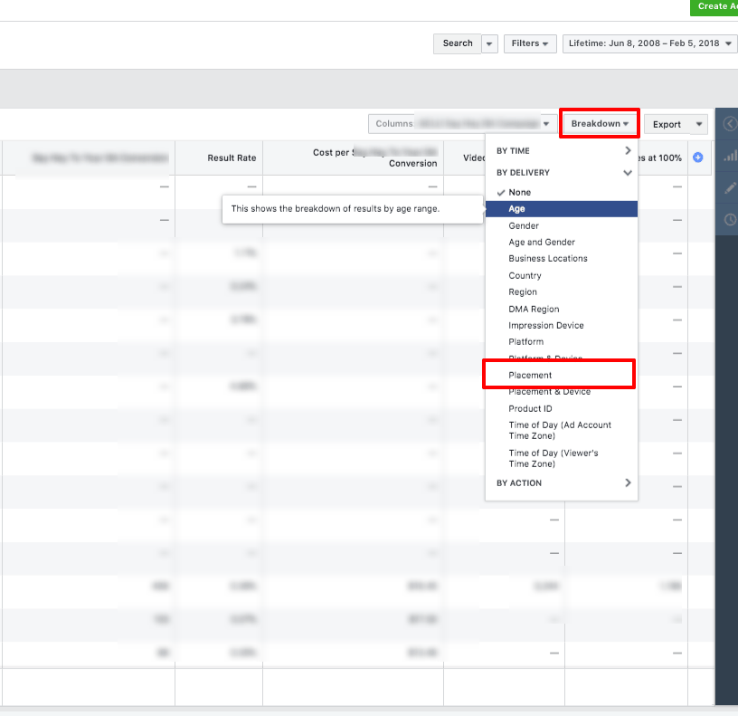
You may also want to export data based on Facebook Ads Manager’s “Breakdown” tool, which allows you to see performance across various segments, without having to set up those segments within your ad sets. For example, you can break down your campaign, ad set, or ad level data by age, gender, platform, or placement. This is especially helpful if you don’t want to create separate ads and ad sets to test all these parameters, but you’d still like to understand how factors like age and gender affect (and vary across) your ads.
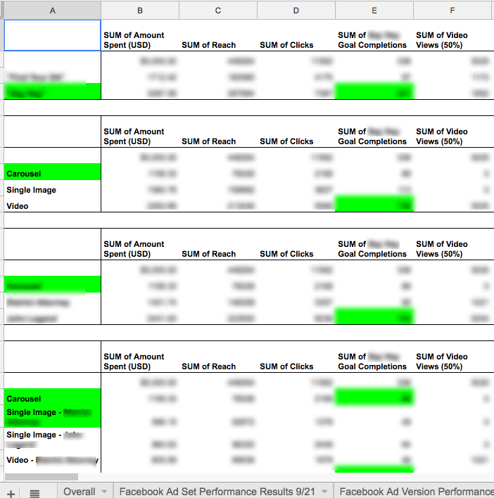
Step #3 – Keep Things Separated: Make some pivot tables!
Food purists and data nerds agree: sometimes it’s best to appreciate one thing at a time. I like using Google Sheets to compile all my data because it’s free, shareable, and has many of the same tools as Microsoft Excel… including pivot tables! Once you’ve exported all your Facebook report data into Google Sheets, add a column to the spreadsheet and copy-paste your Google Analytics conversion data into this column. I recommend using your “content” UTM for ad set data so you can quickly and easily combine data sources. For example, I could create a unique UTM for each audience (“Your Custom Audience” = YCA). If I sort the Facebook report alphabetically by Audience and the Google Analytics report by Ad Content, I can easily combine results with one copy-paste.
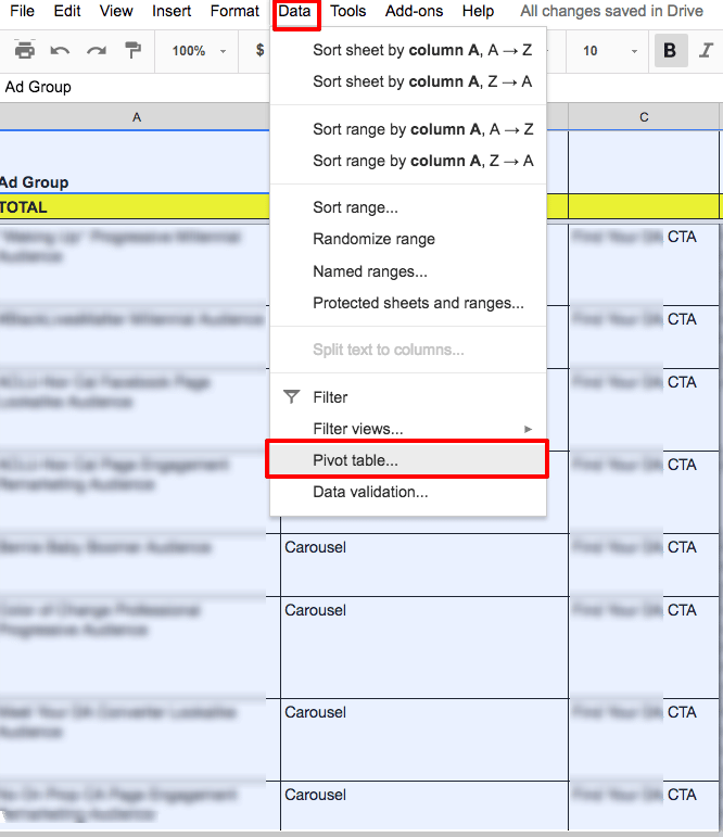
Now, use the “Split Text to Columns” tool (under “Data”) to break your ad names (from step #1) into columns, using a custom separator (in this case, a “-” dash). In the example below, the ad name “Carousel – “[Your CTA]” CTA – [Audience Name] Audience” gets separated into 3 columns, which you can label as “Ad Type”, “CTA”, and “Audience”.
Next, make some pivot tables! I recommend making a pivot table for each major segment you’re testing for both the ad set and ad level data (ex. audience, ad type, CTA). This will allow you see patterns across your ad sets as well as ad variations.
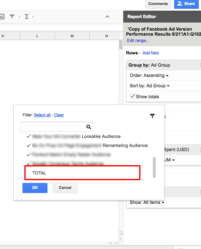
To set up pivot tables, highlight the data you’d like to include in the pivot table. Next, under the Menu, click “Data” and then “Pivot table…”. Note: When selecting your data, you may want to delete or omit the totals of your results, since pivot tables will not distinguish the totals from other data. Alternatively, you can remove the totals by setting up a filter in your pivot table (see below).
Click on the empty pivot table and begin selecting the data you want to include. Usually, rows and values are sufficient, though columns can be handy if you want to add in another layer of data. In this case, your rows and columns are your dimensions and your values are your metrics. For example, I might create a pivot table with “Ad Version” as the row and “[Your Goal] Goal Conversions” as the value. I could also add “Audience” as a column if I wanted to see a breakdown of results for each ad version by audience. Under “Row”, you can choose how to order your data. I usually like to order mine by Sum of Results, descending, meaning the data gets sorted by number of conversions, from highest to lowest.
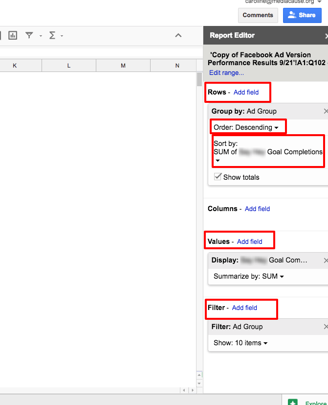
Use the Filter to remove blanks, zeros, or other irrelevant data (in this case, I’ve unselected “TOTAL” since pivot tables already include totals).
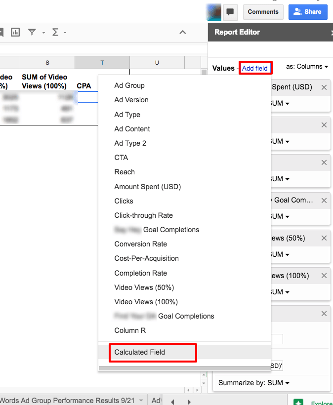
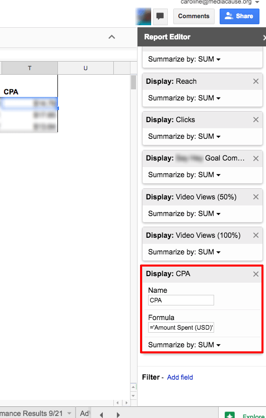
In order to add in cost-per-acquisition (CPA), click-through-rate and other fields requiring formulas, you’ll need to add a “calculated field”. To do this, input the names of the values in the formula (in this case, =’Amount Spent (USD)’/'[Your Goal] Goal Completions’).
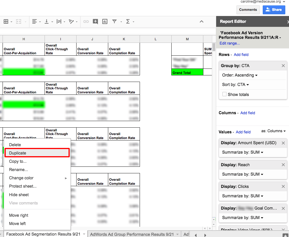
Once you’ve made one pivot table, you can create another pivot table by copying and pasting this table into the same tab. Then, just change the rows and values to a different segment (ex. change “CTA” to “Ad Type”). Do this for all segments you’d like to analyze.
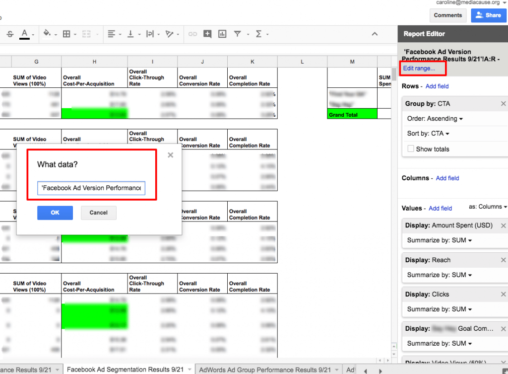
Usually, I like to run reports every week or so, depending on the duration of the campaign. This helps me understand what’s going on with ad performance on a deeper level, in order to make informed decisions about updating my ads and reallocating my budget. I like to duplicate my reports and pivot tables, which saves me from having to create new pivot tables each time I run my reports. To do this, click the tab of your raw report in Google Sheets and “duplicate”. Rename the spreadsheet (including the date) and update the data itself from your exported Facebook and Google Analytics report. Next, duplicate your pivot table. Then click on the table and edit the data range in the Report Editor to pull data from your new tab (ex. ‘Ad Version Results 10/22’!A1:Q92 becomes ‘Ad Version Results 10/29 ‘!A1:Q92). Don’t forget to change the data range if you’ve increased the number of rows or columns your report is using (ex. If you’ve added 11 rows, A1:Q92 would become A1:Q103).
Step #4 – Digest: Sit Back and Analyze your Facebook Ads
Before rushing off to the next thing, take some time to sit back and absorb everything you just took in. Pivot tables allow you to see trends across different segments of your ads, such as audience, device, ad format, ad version, call-to-action, landing page, or whatever else you’re testing. Once you’ve made your pivot tables, take a step back and look for patterns, outliers, and questions in your data. You can use your pivot table columns, rows, values, and filters to drill down for further insights.
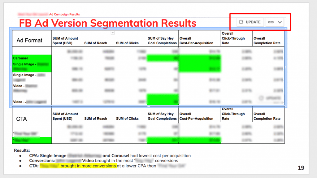
For example, if I created a pivot table with row=”Ad Version” and values=”CPA” and ”[Your Goal] Goal Completions”, I could see that the “Ad Version A” single image ad is generating the most conversions overall, while the “Ad Version B” single image ad has a lower cost-per-acquisition overall. Let’s say I made a pivot table with row=”Audience”, column=”CTA”, and value=”CPA”. I might see that the “CTA Version 2” call-to-action has a lower overall cost-per-acquisition than “CTA Version 1”… except with the Remarketing Audience, for whom “CTA Version 1” had a lower CPA. I can also compare my results from week to week to see how shifts in my ad budget may affect performance across multiple ad segments.
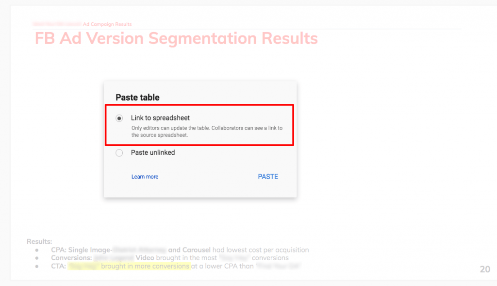
Additionally, if I want to share or present this data with others, I can copy and paste my tables, charts, and pivot tables in Google Slides. By choosing “Link to spreadsheet”, I can update the table within my presentation anytime I edit the table within Google Sheets.
Step #5 – Get Moving: Optimize your ads based on data insights
You’ve just consumed and processed some clean, high-quality data. Now what? Here are some recommendations for how to put this data to good use:
- Boost highest performers: Boost the budget for your audiences achieving the lowest cost-per-result and the most results (based on your primary goal).
- Pause lowest performers: You notice that video ads have higher conversion rates than single image ads for one audience. You may choose to pause single image ads for this audience.
- Add in new ad versions: Let’s say that carousel ads are outperforming single image ads. You may choose to create additional carousel ads testing out new creative or different copy variations.
- Modify your audiences: Within one audience group, you notice that women ages 35-44 have a higher conversion rate than women ages 45-54. You can update your audience age range to target women ages 35-44.
- Modify your ad placement: If you notice that ads viewed on mobile devices have a significantly lower CPA than desktop ads, you may choose to update your ad placement to only include mobile.
When it comes to optimizing your ads, let the data tell you what to do. Once you have a clear picture of how your ads are performing, there are so many possibilities. 🙂
Need help getting started with your Facebook ad campaign? Check out my 5 Steps to De-Stress your Facebook Set-up (and your life) and learn How to Track Facebook Conversions in Google Analytics.
We want to hear from you. What tools and tricks have you discovered to analyze and optimize your Facebook ads?
Ready to take your Facebook ad campaigns to the next level? Need some help getting there? Get in touch! We’d love to help.