6 Tips for Optimizing Web Experiences
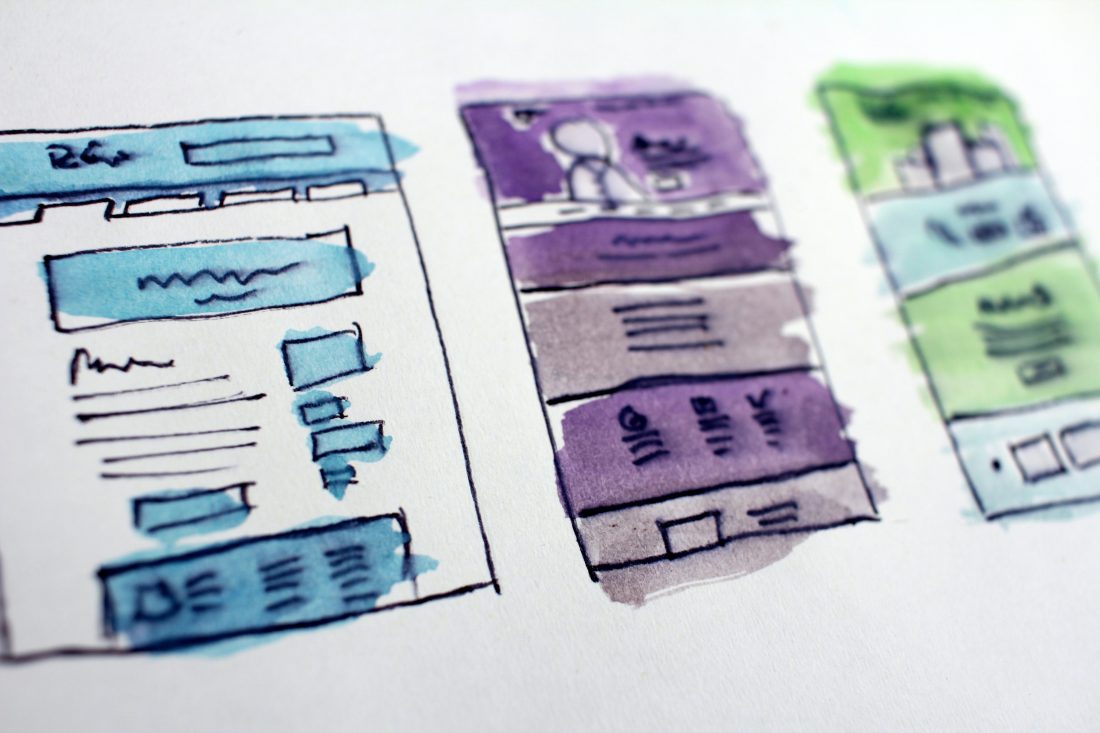
When it comes to web design, things are constantly evolving and changing. A site from two years ago feels dated, and every day new technologies push the limits of what’s possible. But don’t throw in the towel—even in an ever-changing landscape, there are still universal tips and truths you can follow to optimize your reach, attract and retain more supporters, and improve your user experience.
Here are six universal tips to make your nonprofit website user-friendly:
1. Define who your site is for.
With a website, you can reach anyone in the world with internet access. This is a beautiful thing, but it also gives companies and organizations the misconception that their website is for everyone. It is not. It’s not realistic to think everyone is invested in your product or services. And out of your actual audience, not everyone needs to visit your website. This may sound harsh but the sooner we accept this, the sooner we can define who our audience really is. We can use data to track our audience, as well as define who we want our audience to be. The same way we define who our brand is for, we should define who our website is for. Defining the audience will help us make better decisions about what to include and what to leave out.
2. Specify what your site is for.
What is the purpose of your site? Is it to educate people about your nonprofit? Is it to share thought-leadership content? By having a clear objective, or a small set of objectives, you can structure your site to make that action easier to accomplish.
3. Make it frictionless.
One of the best, most straightforward books about user-experience and websites is the book Don’t Make Me Think by Steve Krug. The book came out during the birth of the internet and many of the principles featured in the book still hold true today. Krug talks about how the web should be straightforward. People don’t want to spend time trying to figure out the next action. It needs to be crystal clear and friction-free. On the web, we must make it as easy as possible for the user to take action—fewer clicks and form fields mean less friction and higher conversions.
4. Stick to what the user knows.
In the same spirit of making your site frictionless, your site should follow common user patterns. What do we mean by that? If we take a look around on the web, you will see that many websites are structured in the same way. The logo is in the top left corner and links back to the homepage, the menu is traditionally on the right. The labeling of menu items often follow the same terminology: home, work, about, contact. The reason for this is not because web designers are lazy or developers are using templates. It is because humans like patterns, it allows them to think less. In the physical world we’ve learned that pushing a handle down opens a door. In the digital environments, there are similar, well-established user patterns we should follow.
5. Make it actionable.
When it comes to user behavior on the web, people want to get the information and get on with their day. This is why we need to make actions clear and consistent. Ask yourself, what is the action you want the user to take on your site? Do you want them to share your content? Make a donation? Do you want them to put things into their shopping cart and follow through with a purchase? Whatever the action might be, make it easy to complete. Making a page actionable also means we should avoid creating dead-end pages. Each page should give the user a clear next step. An “About” page that talks about your company is great, but you should also give the user an action to take. Do you want them to contact you? Do you want them to learn more by reading your blog? Do you want them to fill out a form? Figure the next step out and make it happen.
6. Make it scannable.
Gone are the days of hours of reading and taking in content. We live in the “attention economy” and our content needs to adjust. People consume content differently depending on the medium, and the web is one area where people tend to scan the content rather than read it all. Because of this, your content needs to consist of bite-size information with many callouts.
Bonus:
Forget about the fold. Above the fold is an expression leftover from the days when newspapers came folded over, with the most important information displayed above the fold. But in the world web, there is no fold. Websites are responsive. This means they adjust and scale based on the size of the user’s screen. This means that the so-called fold will change depending on the user’s screen. Because of this, what is shown without scrolling can’t be controlled, and should not be your focus. Additionally, users love to scroll, and users don’t spend much time at the top of the page at all. Most people start scrolling before the page even loads all the way. This study shows that only 70% of users saw the content at the top of the page at all.
Of course, this isn’t an exhaustive list—there are many more ways to improve your website, but they will always lead back to the user. The user should be at the center of all design decisions and their natural behavior should line up with the structure of your site. If it doesn’t, make the needed changes and see what happens, or feel free to contact us to see how we might be able to help.