How to Create Effective Landing Pages for Your Nonprofit
What is a landing page?
A landing page is “a standalone web page distinct from your main website, that has been designed with a single focused objective in mind.” For example, the goal may be to get users to sign up for a free trial or download a free Ebook in exchange for providing information, such as their name and email address.
Why are landing pages important?
Landing pages are an essential element of your Google Grants strategy and lead to its overall success by increasing your conversion rates. For example, San Francisco-based Futures Without Violence (FWV) wasn’t having any difficulty using Google Grants to get users to their website -the issue was that most visitors to their site only stayed for a few minutes and didn’t return. They needed to form a long-term relationship with these visitors in order to create true value from their Google Grant.
The solution? Landing pages. We created a strategy to build custom landing pages that collected email addressed from FWV supporters. To implement the strategy we used resources that FWV already had available. We discovered through Google Analytics the top downloaded fact sheets and created landing pages that offered these fact sheets to supporters in exchange for their email address. Fast-forward to a couple months later, and FWV was now adding 1,000+ emails per a month and growing. Adding a few best-practice landing pages made a huge impact on the value of Google Grants for FWV.
So, how can you create effective landing pages?
There are 7 main elements that make up the anatomy of a landing page. Below you will find brief descriptions, examples and tips on how to create a successful landing page.
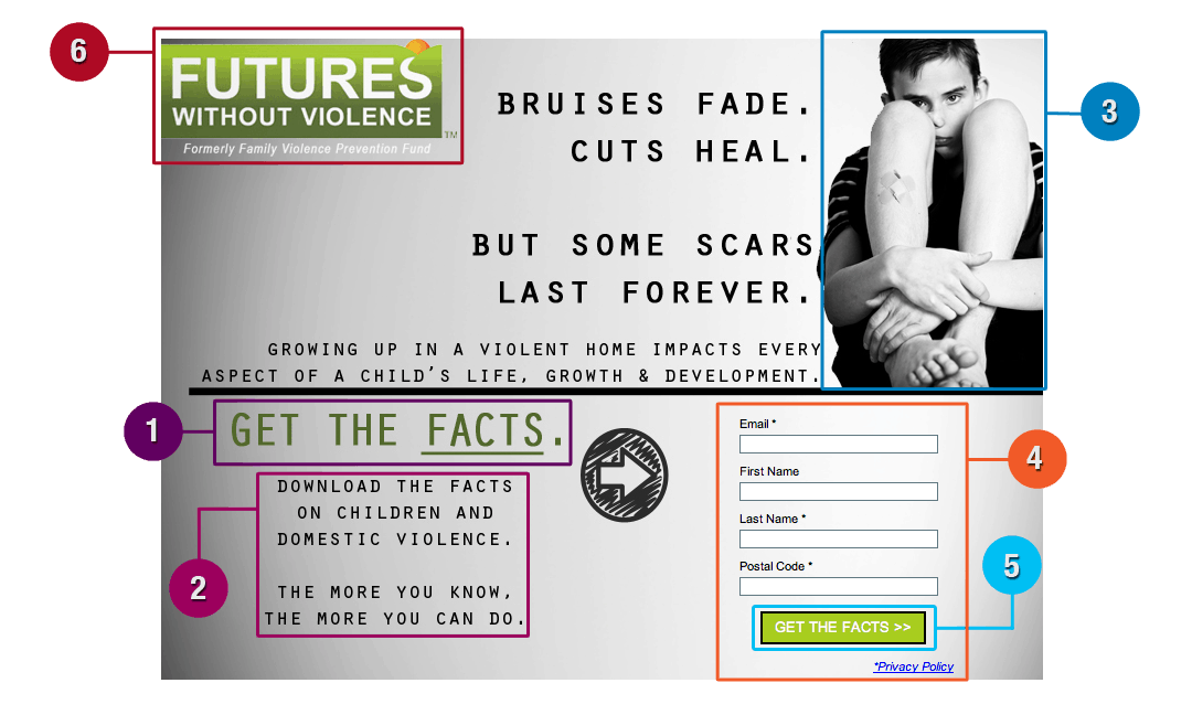 1) Headline
Attention spans are short and there is a plethora of content competing for your eyes’ gaze, especially when surfing the black hole that is the interwebs – therefore, your goal is to attract the attention of your viewer and “communicate your core value proposition” as clearly and concisely as possible. The headline is often the first thing the reader sees, and you want to make sure they can understand what you are offering before they can even think about clicking to another page.
*TIPS:
- Use simple, concise language that gets straight to the point
- Write in the second person and using action-oriented language to help capture the reader’s attention.
- Be consistent! Make sure the headline matches your ad copy and call-to action text. For example, if your visitors click on an ad telling them to download a fact sheet, they are expecting to be directed to a page where they can do just that. Make it obvious that they’re in the right place when they arrive on your landing page by keeping your ad copy, headline and copy consistent. (And keep in mind that your headline is important for your Google AdWords quality score too)
Example: The ad copy the viewer sees matches the landing page copy.

2) Copy & Format
The body of your landing page should further describe what your offer is and why visitors should download or sign up for it — therefore, your goal is to make clear the benefits of completing the form and answer the question “What’s in it for me?” You need to not only create and deliver value in the offer itself, but also convey that value on your landing page.
*TIPS:
- Content should never be longer than 5 lines
- Proofread — Make sure there are no grammatical or spelling errors
- Write in a way that tells the viewer how the product or service will benefit them or their organization by writing benefit-based sentences
The format of your landing page is equally to the success of your landing page as the content. Format your page in a way that makes it easy for viewers to understand the offer, the value, and the action they need to day. Your goal should be to convey the top 3 or 4 most important pieces of information almost immediately. Your formatting style should draw your viewers’ attention to the key components of your page very quickly, allowing them to take in and process the information in a shorter amount of time.
*TIPS:
- Use bullet points and numbering to simplify the visual layout of the text
- Use bold or italicized text to highlight main focus points
3) Image
Images catch a viewer’s attention instantly — your goal is to use a relevant and captivating image that reinforces the benefits of your offer. This serves as a way to further engage and entice the visitor to complete the form.
*TIPS:
- You can also use videos to explain the offer or give additional information as another fun way to convince your visitors to fill out the form.
- When possible, it’s better to create an original photo or video demo rather than using a stock photo.
4) Form
The form is a crucial element of your landing page, since this is where the conversion takes place. The main questions to answer are what to include and how long to make it – Your goal should be to collect enough information through your form to enable you to both contact and qualify the lead. Or as Unbounce puts it:
To entice someone to complete your form you need to match the perceived effort involved in completing it (the length and personal nature of the form and it’s questions), with the ‘size of the prize’ (the item you offer in return, such as a discount, an ebook or a webinar registration).
*TIPS:
- Make sure the form appears above the fold — You don’t want the viewer to have to scroll down the page in order to see it.
- Form Headline — Clearly state what action the viewer can execute on this page.
- Make the form stand out on the page – Surrounding it with a colored box helps isolate it from the rest of the content.
- Privacy and Security – Many people are hesitant when asked to provide sensitive information. You need to show your visitors that they can trust you with their information; a simple way to do this is by including a link to your privacy policy.
5) Call-To-Action (CTA)
Your CTA is the action you are asking the user to complete (such as download a fact sheet). You want your CTA button to be engaging and relevant to your offer – Your goal is to create an effective CTA button that grabs the user’s attention and entices them to click.
*TIPS:
- Text such as “Click Here” and “Go” perform better than “Submit”.
- Use negative space effectively – Make your CTA button stand out from surrounding content and command attention by incorporating blank space between your content and your CTA button.
- Size – Make your button large enough to stand out without overwhelming the design.
- Color – Make sure the color you use sets the button apart without clashing with the page’s overall design. Contrasting colors are a good way to make your CTA stand out more.
- Language – Use simple and direct language. You want visitors to know exactly what they’ll get when they click.
6) Logo and Hidden Navigation Bar
DO: Add your logo to your landing page – this makes it look more credible and helps garner the viewer’s trust.
DON’T: Include a navigation bar along the top or bottom of the site — this increases the likelihood that the visitor will get distracted and click away to another part of the site before filling out the form. You can bring back your navigation and keep the visitor moving through the site with other offers on the thank you page after the form has been completed.
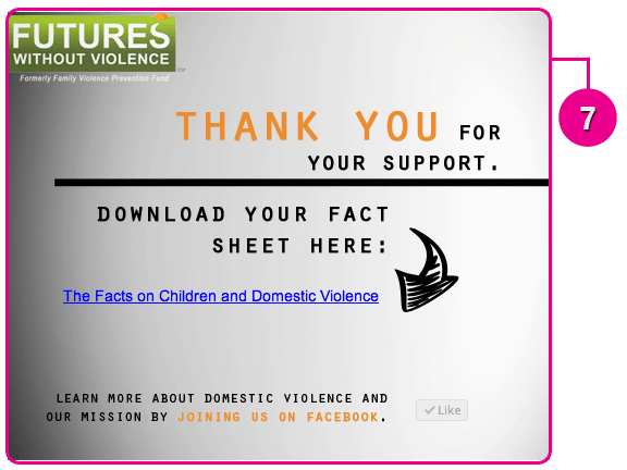
7) Thank You Page
This is the page that users are directed to after completing the form. Take advantage of the viewer’s attention by asking them to do something else after the conversion. For example, this is an ideal time to ask them to sign up for your newsletter or join you on social networks.
Looking for a platform to create best-practice landing pages for your organization? Media Cause is a big supporter of Unbounce, a cloud-based software that makes it easy to create, publish and test landing pages. And the best part? They offer a SERIOUSLY GENEROUS discount price for non-profits.
You’re armed and ready to create compelling and effective landing pages – So get out there and start getting the most value out of Google Grants by turning visitors into active supporters.